Editorial Design
Northbound Field Notes: A Usable Atlas of Walking Research
Routes, field notes, photographs, and environmental data become a report that works both at a desk and on a walk.
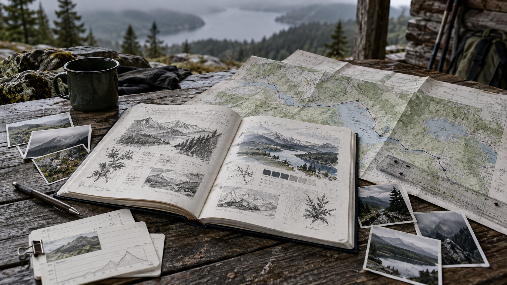
Materials speak different languages
The project combines twelve walking routes, researchers' notes, sensor data, and hundreds of field photographs. Complete source documents were difficult to use across desk reading and walking outdoors.
A dual structure
The atlas alternates route pages and observation pages. High contrast routes, distances, and times support quick outdoor reading. Lower contrast observation pages bring photographs, excerpts, and data into a slower rhythm.
Continuous color bands along folded edges identify riverbanks, industrial districts, residential areas, and woodland. They provide an index when the book is closed and directional cues when opened.
Type and marks
Robust sans serif typography carries main information, while notes use more generous leading. Legends use circles, lines, and short dashes, keeping small symbols clear.
From paper to the web
The digital edition filters routes by length, terrain, and theme and provides printable single page route cards. Shared numbering keeps references consistent between media.
The aim is to help readers find their next step at the right moment.