Editorial Design
Between Spaces: An Independent Journal About Domestic Boundaries
Variable margins, translucent inserts, and a restrained image rhythm turn boundaries into a readable editorial structure.
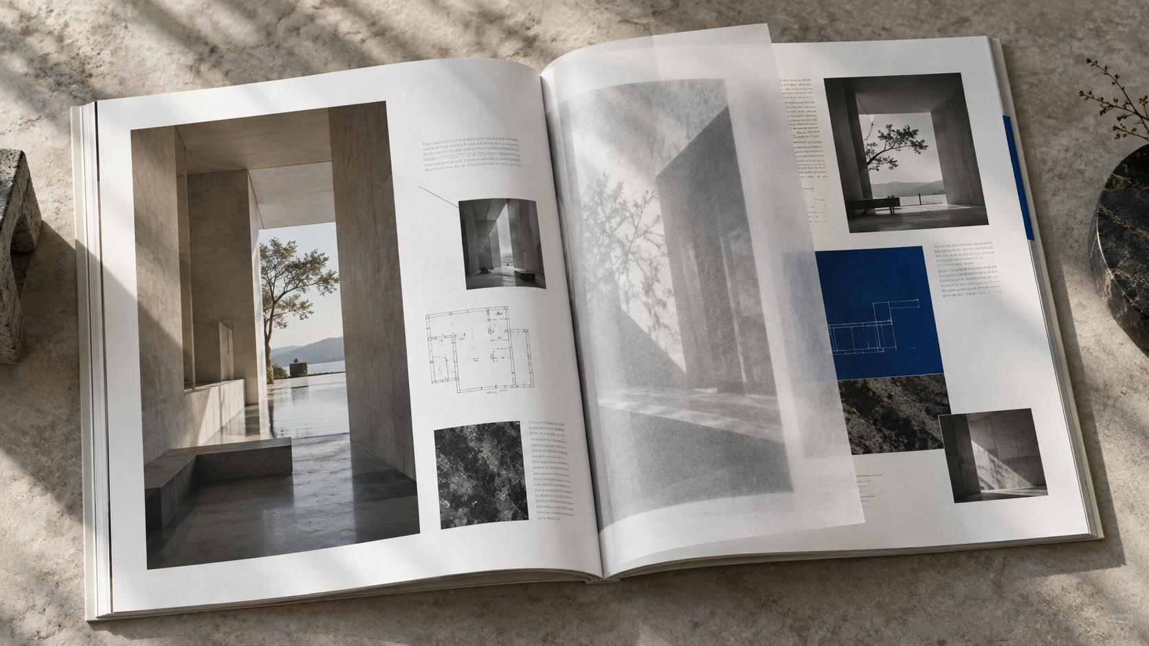
The editorial question
Between Spaces is a fictional annual independent journal. Its first issue explores doors, windows, corridors, and shared boundaries in urban housing. Long essays, photographic interviews, residents' sketches, and legal extracts vary greatly in density.
Layout strategy
We translated boundaries into variable margins. Personal stories receive generous outer margins, as if readers were approaching from outside a door. Rules and data occupy tighter columns. Photographs across spreads can cross the binding and briefly connect two spaces.
The publication uses two typefaces: a serif with human details for the body and a neutral condensed sans serif. Page numbers, addresses, and interview times sit at the edges, creating an index layer reminiscent of architectural drawings.
Materials
The body uses slightly warm lightweight paper. Translucent tracing paper separates chapters, allowing the outline of the next floor plan to appear early. Reading gains moments of overlap and delay.
Digital extension
The website organizes entry points by theme, place, and person. Essays retain comfortable reading widths, images can expand, and references and sources remain clear.
Editorial design makes relationships between content perceptible on paper and on screen.